Conectica
An app designed to facilitate adults to meet others who are interested in the same things, by providing a space where they can create and post an activity they would like to do quickly.
Role: Lead UX Researcher & Designer
Timeline: 10 weeks
Tools: Figma, Invision
Type: Academic
Problem Space
"Making friends as an adult is hard. because as you get older, making friends no longer happens organically."
According to a psychologist and professor at the University of Maryland. Once adults leave the school setting, they have to face, well... life.
Work becomes a priority and the time that was used to socialize is now spent on responsibilities.

The objective
of this research is to understand what motivates or prevents people to build new friendships and explore solutions to help them make deeper connections.
Secondary Research
Through my research, I found that...
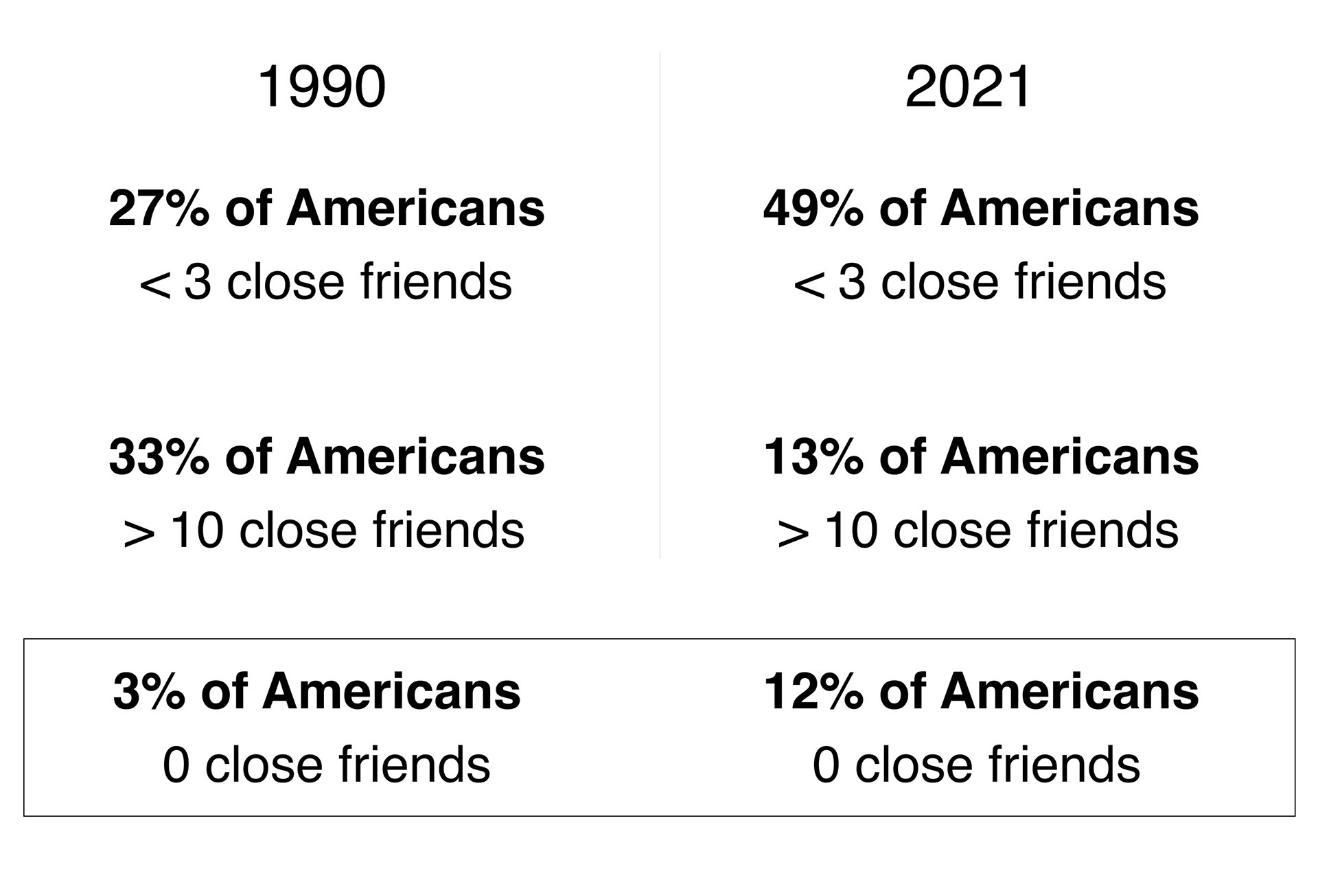
The May 2021 American Perspectives Survey finds that Americans report having fewer close friendships than they once did, talking to their friends less often, and relying less on their friends for personal support.
Hypothesis Statement
I believe that...
Providing enough information about interests and beliefs, people will be able to connect with others with similar points of view and increase friendships in their lives. I will know this is true if the percentage of people reporting fewer than three close friends is reduced.
Assumptions
Before conducting the primary research a laid out a set of assumptions to analyze what I currently believe and open the research to what is actually needed in this space.
1. It is easier for adults to make new friends when they meet other people of the same age and interests.
2. By providing the right setting adults that work from home will find it easier to make new connections.
3. Feelings of loneliness will decrease if adults can attend their favorite events with people that also enjoy them.
4. Most adults have used at least one app dedicated to meeting other people.
Primary Research
To further understand the problem and people's needs, if any,
I conducted 5 decontextualized interviews. They provided insight into how they feel socially in general. But also specifically how are they satisfied with their friendships. It is not about how many friends they have but their quality and if they have a desire to make new friends to perhaps fulfill certain areas in their lives. How likely are they to use an existing app and how successful has been for them.
Participant's Criteria
Age group 25 - 44 years old
Professional
Live in the United States
Have used apps to meet people
Professional
Live in the United States
Have used apps to meet people
Interview highlights
These interviews helped me understand better current behaviors and needs. What pain points and gaps need to be addressed.
Past and Existing
Connections
Connections
Having around 4 friends is the average, it is
important these friends can be trusted and
unconditional. Seeing close friends twice a
week is common among the interviewees.
New Connections
Although all experience some level of both
extroversion and introversion it does not
prevent from having easy conversations with
people. But it does take time and energy.
extroversion and introversion it does not
prevent from having easy conversations with
people. But it does take time and energy.
Activities
There are many activities people like to
enjoy with others. Nevertheless, there's at
least one activity they would like to enjoy
with a friend that isn't currently happening.
enjoy with others. Nevertheless, there's at
least one activity they would like to enjoy
with a friend that isn't currently happening.
Time Investment
Many times is difficult to set time aside to
socialize because work and school take a lot
of time and energy. Thus, making new
friends isn't always easy.
socialize because work and school take a lot
of time and energy. Thus, making new
friends isn't always easy.
How Might We
make it more convenient for people
to meet so that it's easier to create deeper connections?
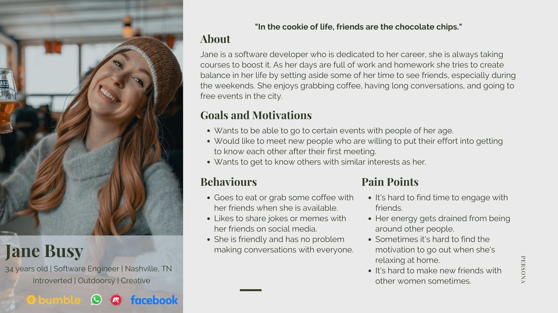
Persona
After all the information was gathered I created a persona that would reflect the user of this app
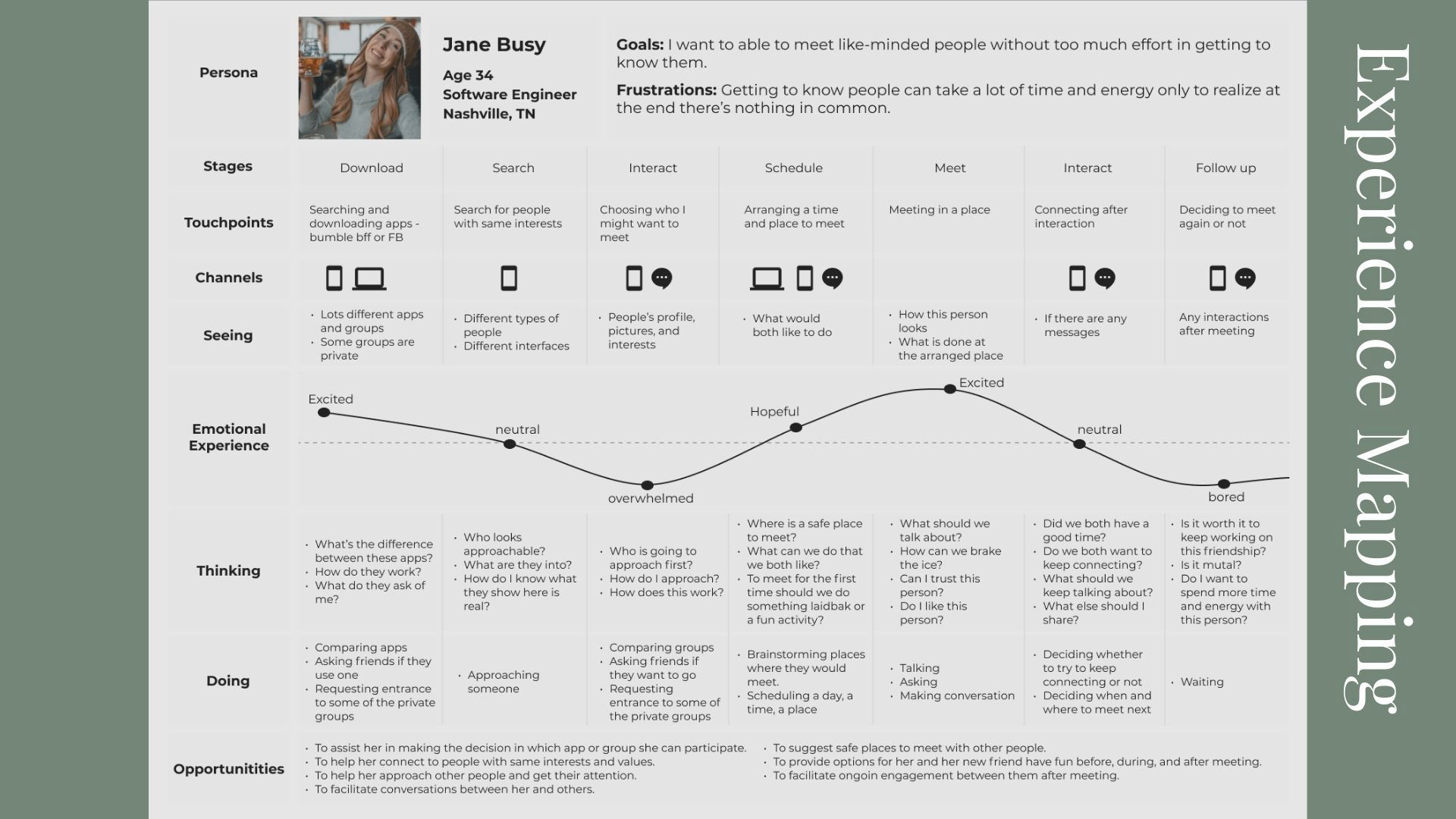
Experience Map
The experience map illustrates what a user currently goes through in the process of meeting people online. This helps understand what opportunities are there to improve their journey.
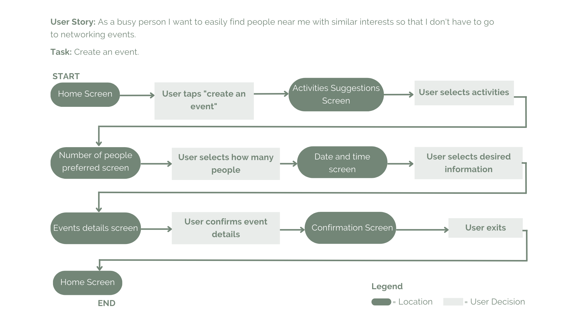
Task Flow
After analyzing all the research gathered I started to create 20 - 30 user stories which were then organized into epics. One core epic was selected and from there one story, which was then translated into a task flow.
Exploratory Sketches
To explore what elements I would have on the app I went to look at some existing apps and created an inspiration board to look back to. So that I could start sketching how the solution could look like.
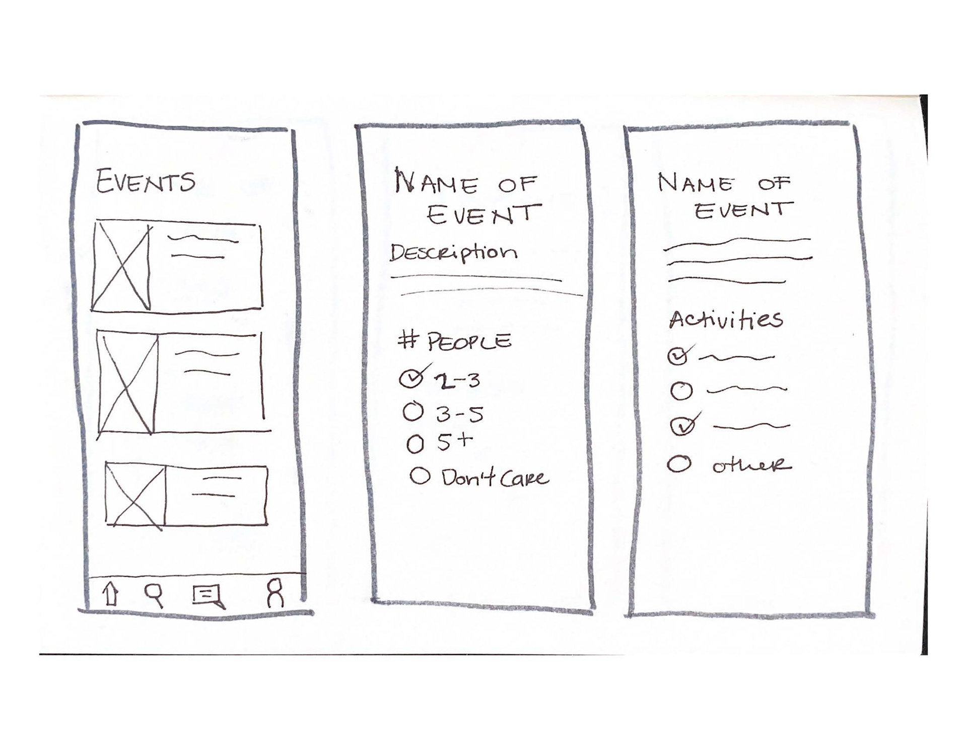
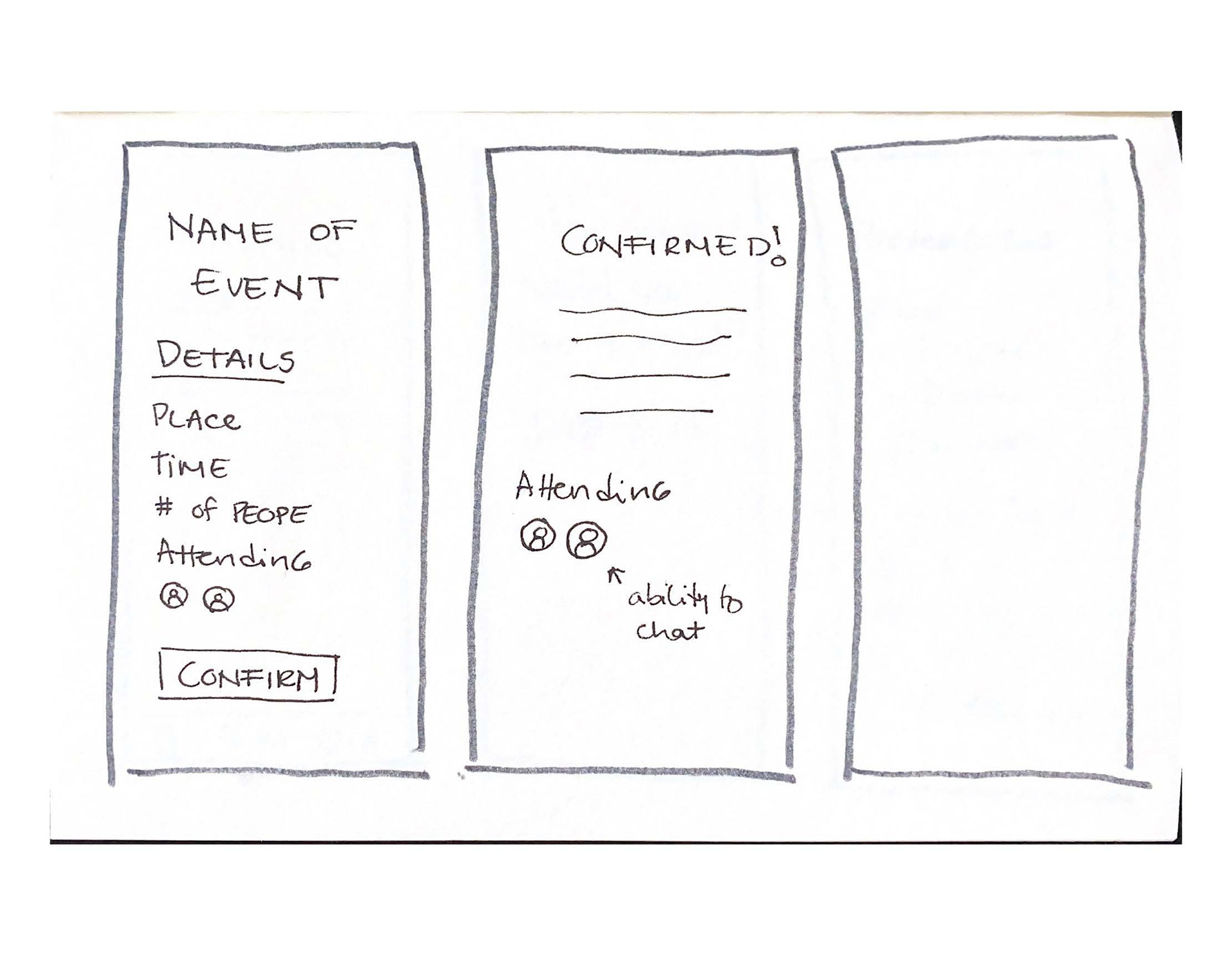
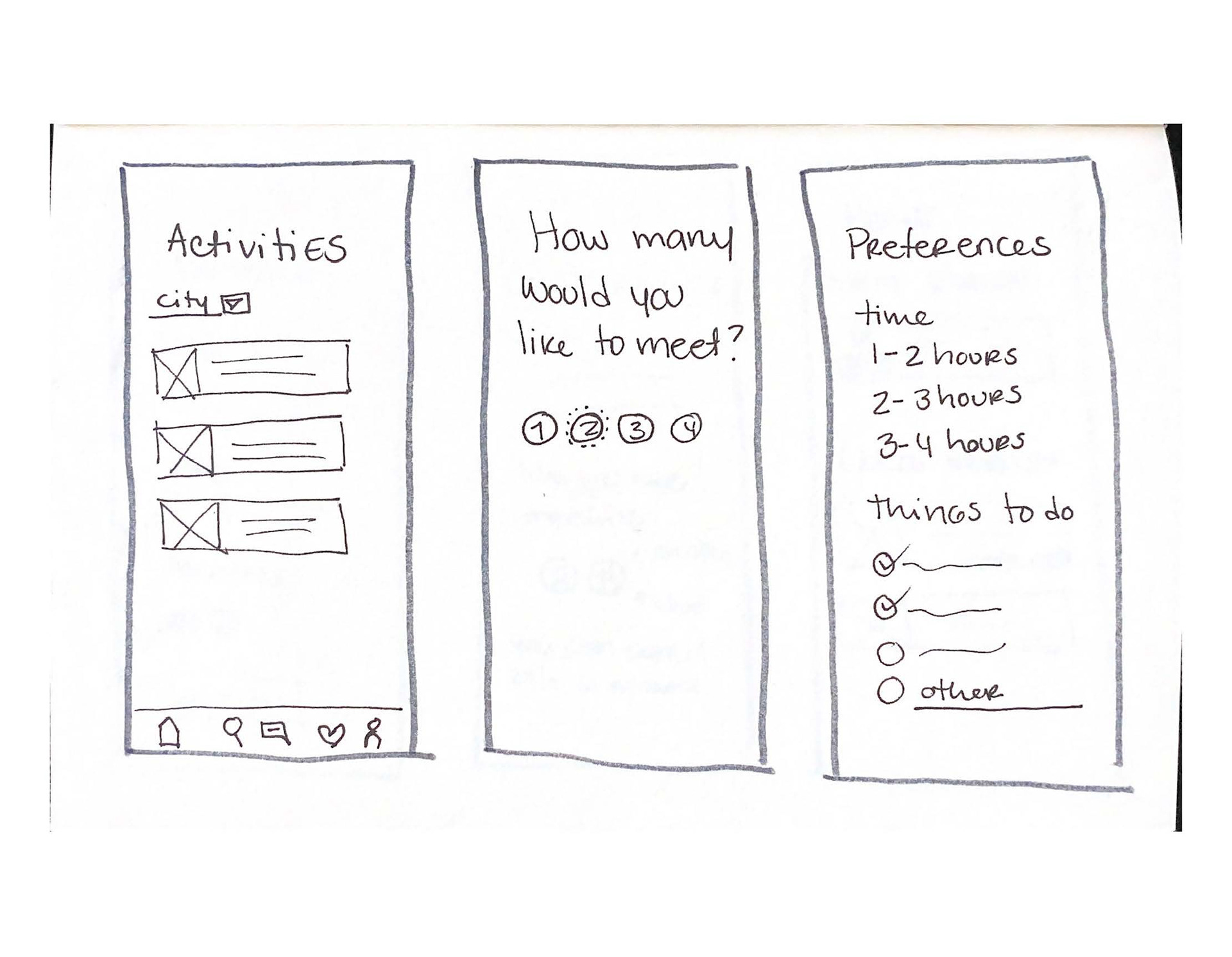
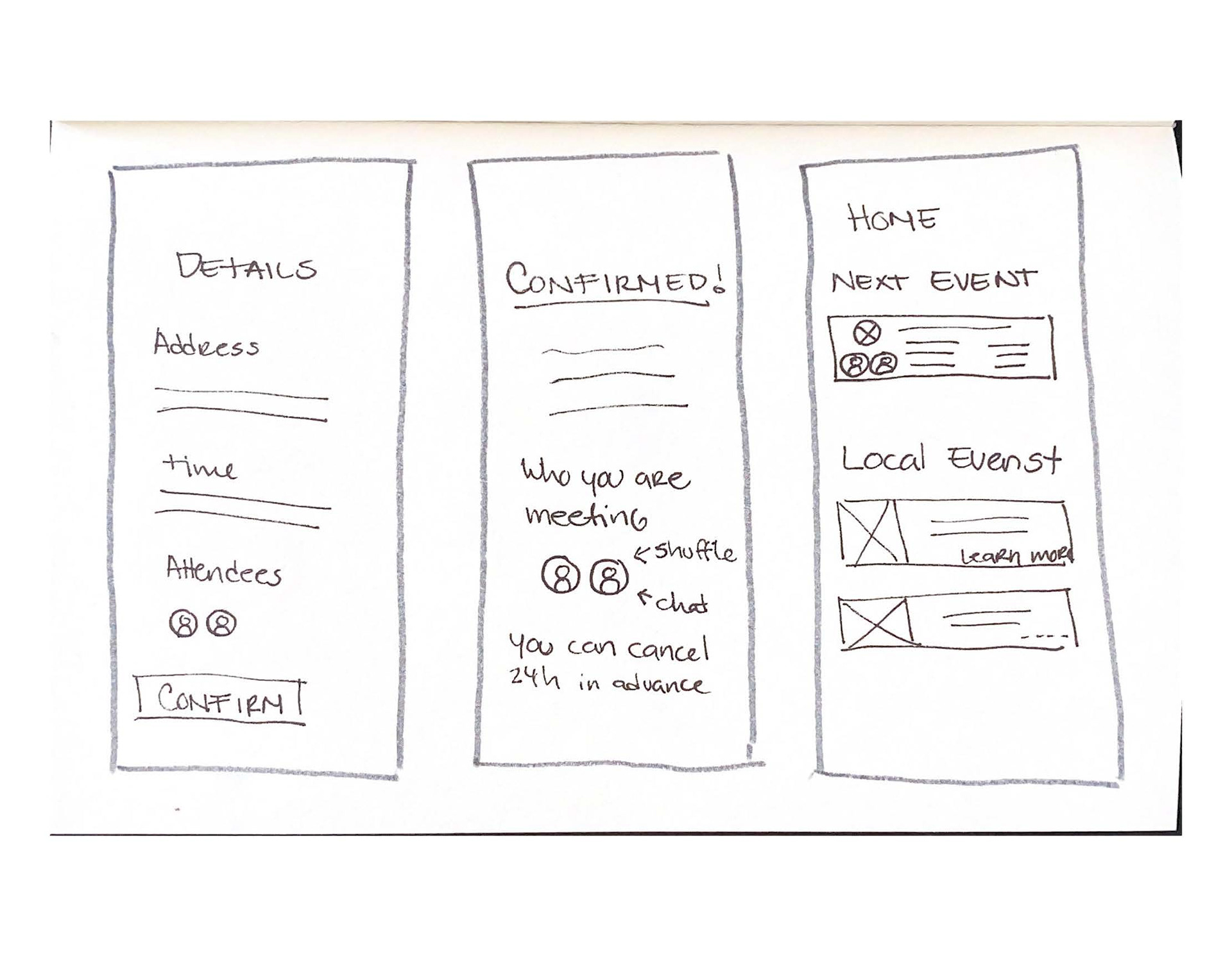
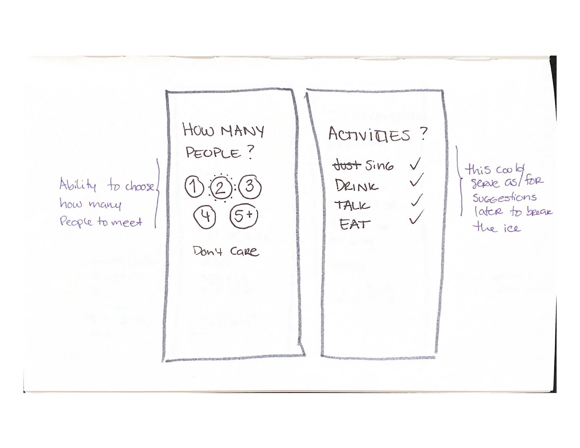
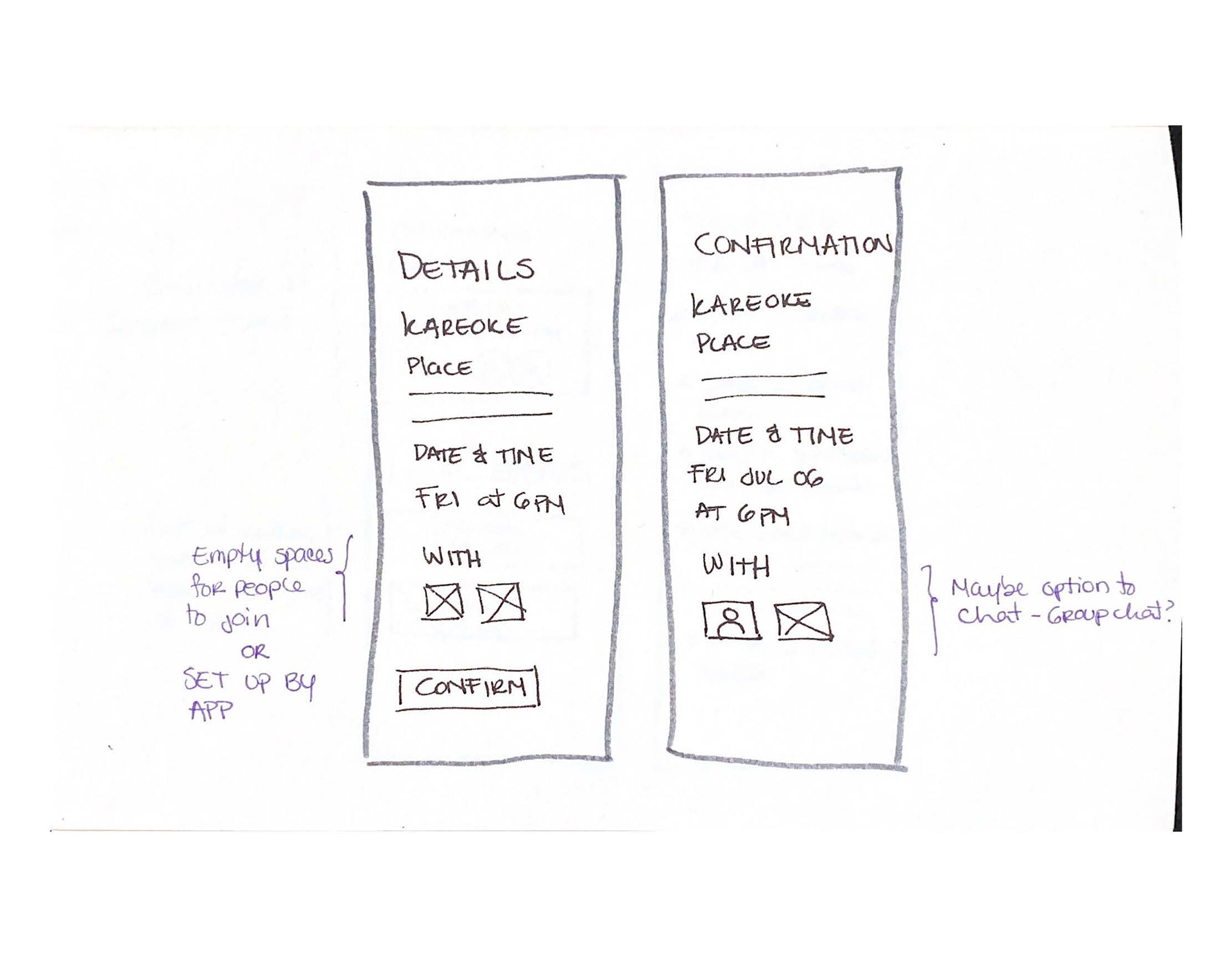
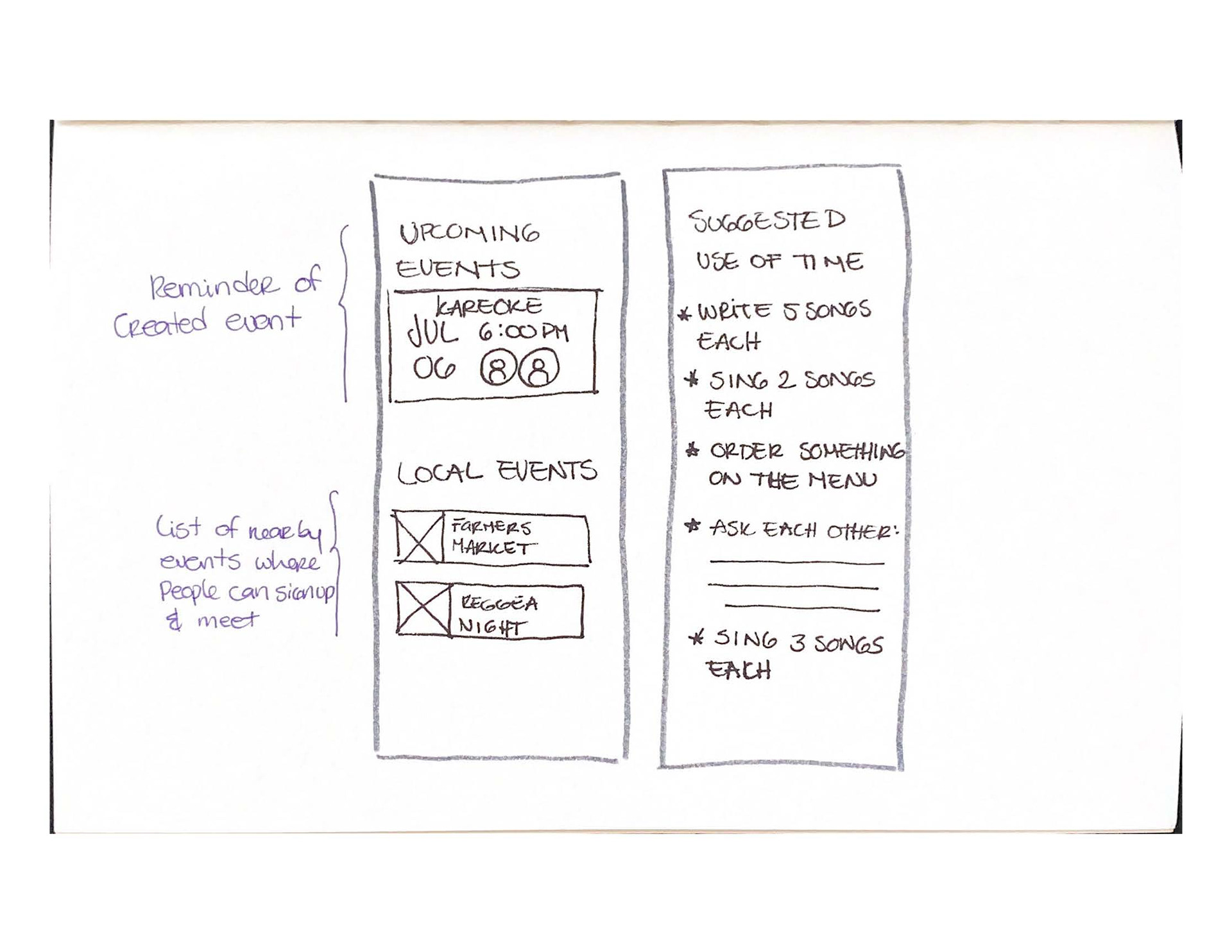
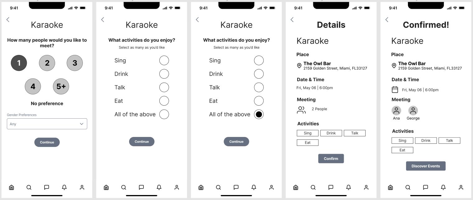
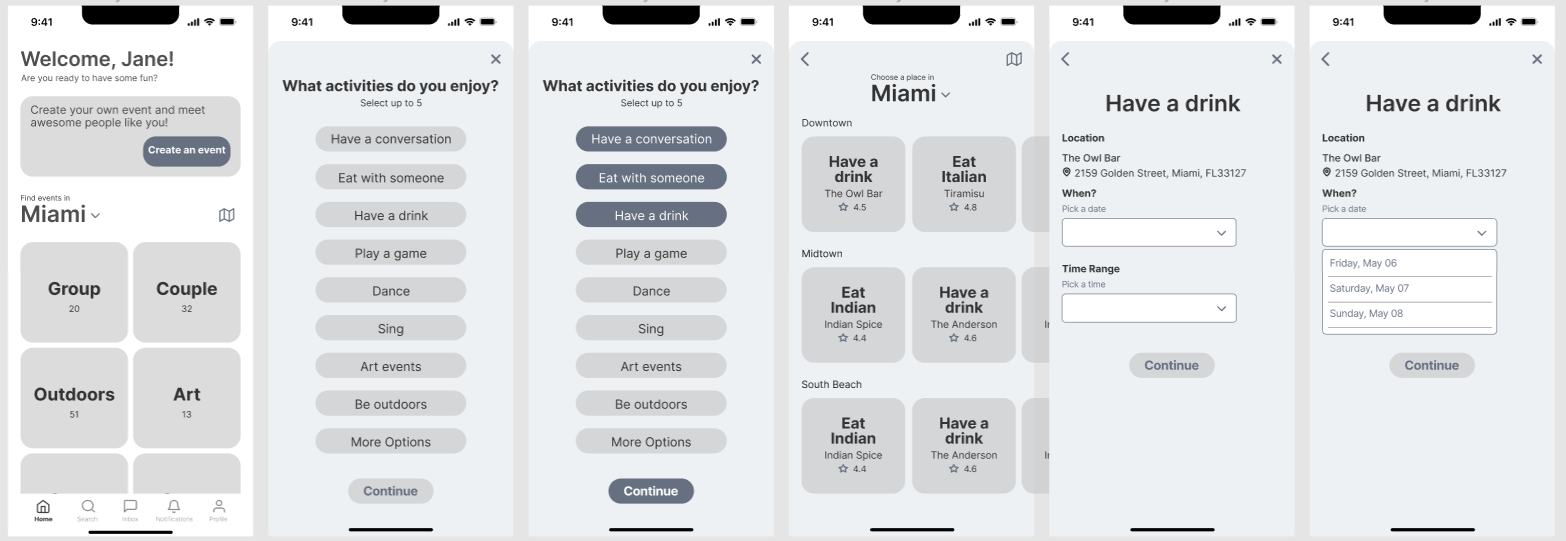
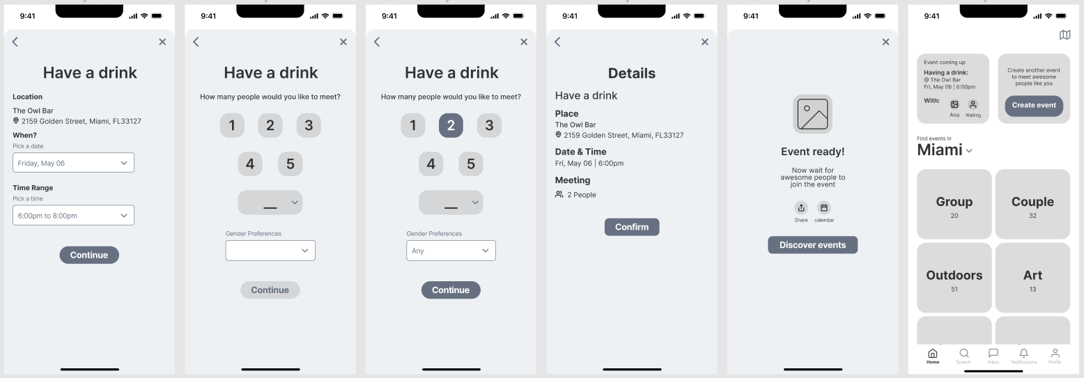
Greyscale Version i
After about 5 sets of sketches, I was then ready to make the ideas into mid-fi wireframes. Here is a look at the first version.
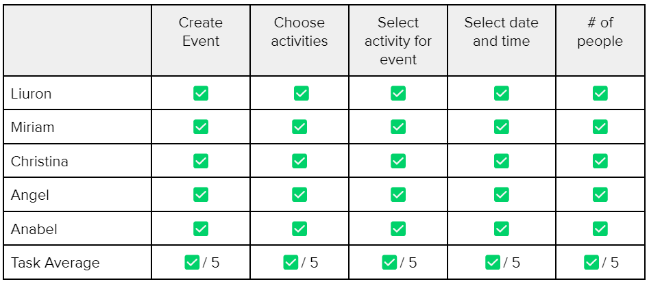
User Testing
To be able to determine if the prototype works as intended a usability test was conducted with 5 users to obtain practical, real-time feedback about the functionality and overall flow of the task. This helped improve the design and provide a better user experience.
It was conducted online through video calls and screen sharing.
5 users were asked to complete a set of tasks.
The goal was to create an event effortlessly.
1st Round
results
The task was completed fairly easily because each task involved specific answers.
However, their thoughts gave insights into some areas that needed improvement.
However, their thoughts gave insights into some areas that needed improvement.
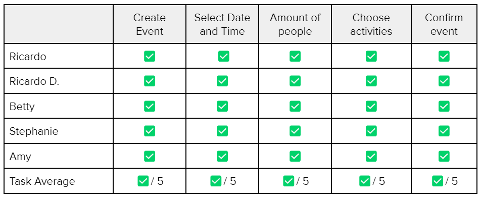
All tasks given were completed without issues
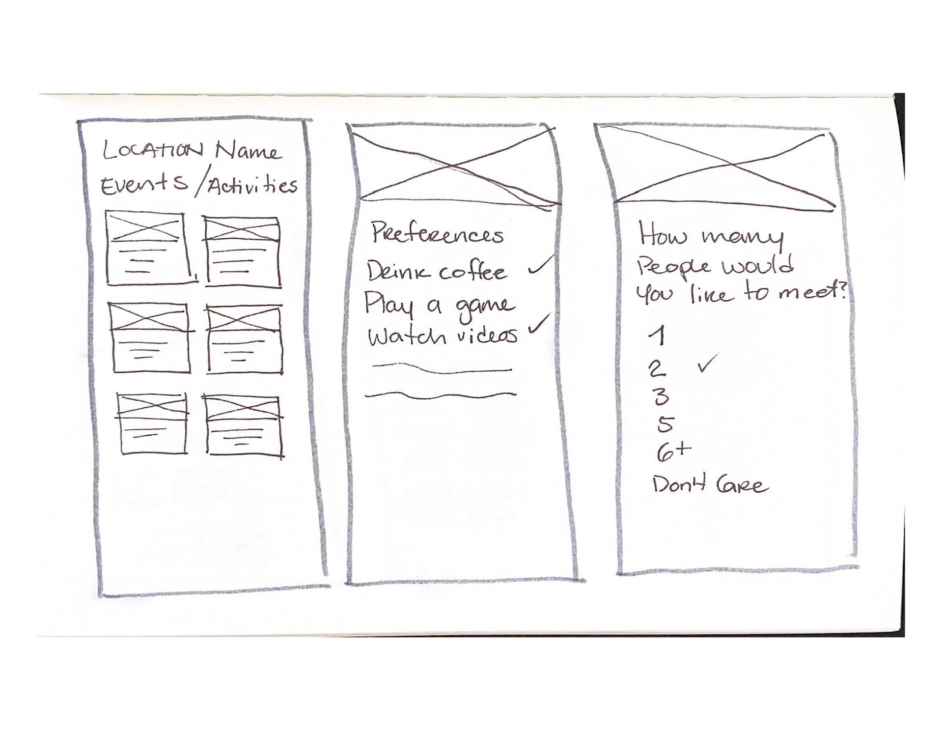
Having the selection of activities was welcomed but it can be used as a tool to filter earlier in the creation of the event.
There should also be an option to choose different areas in the city to go and do those activities.
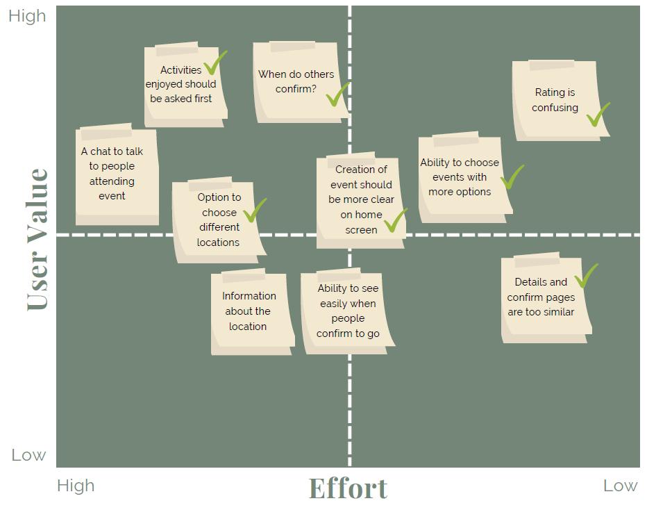
Design Prioritization Matrix
This is a peek at the matrix used to determine what issues need to be prioritized and changed to improve the usability of the app.
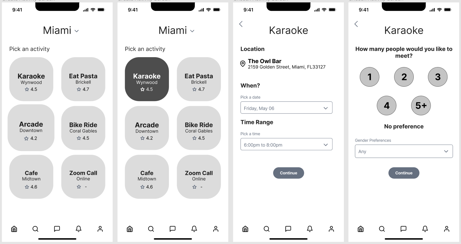
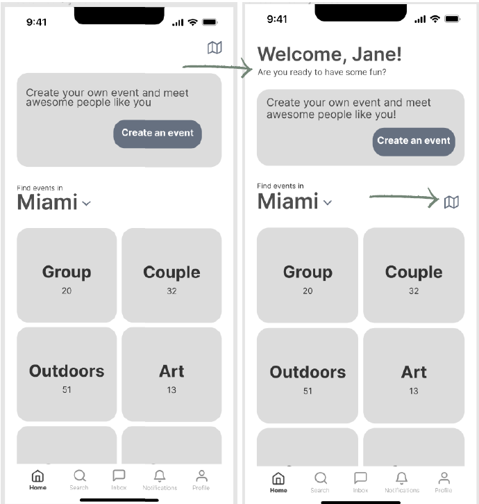
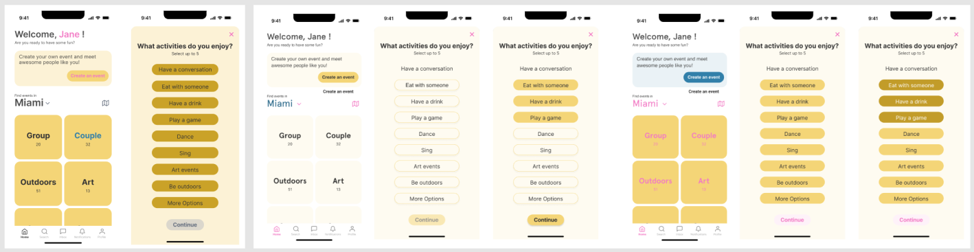
Greyscale Version II
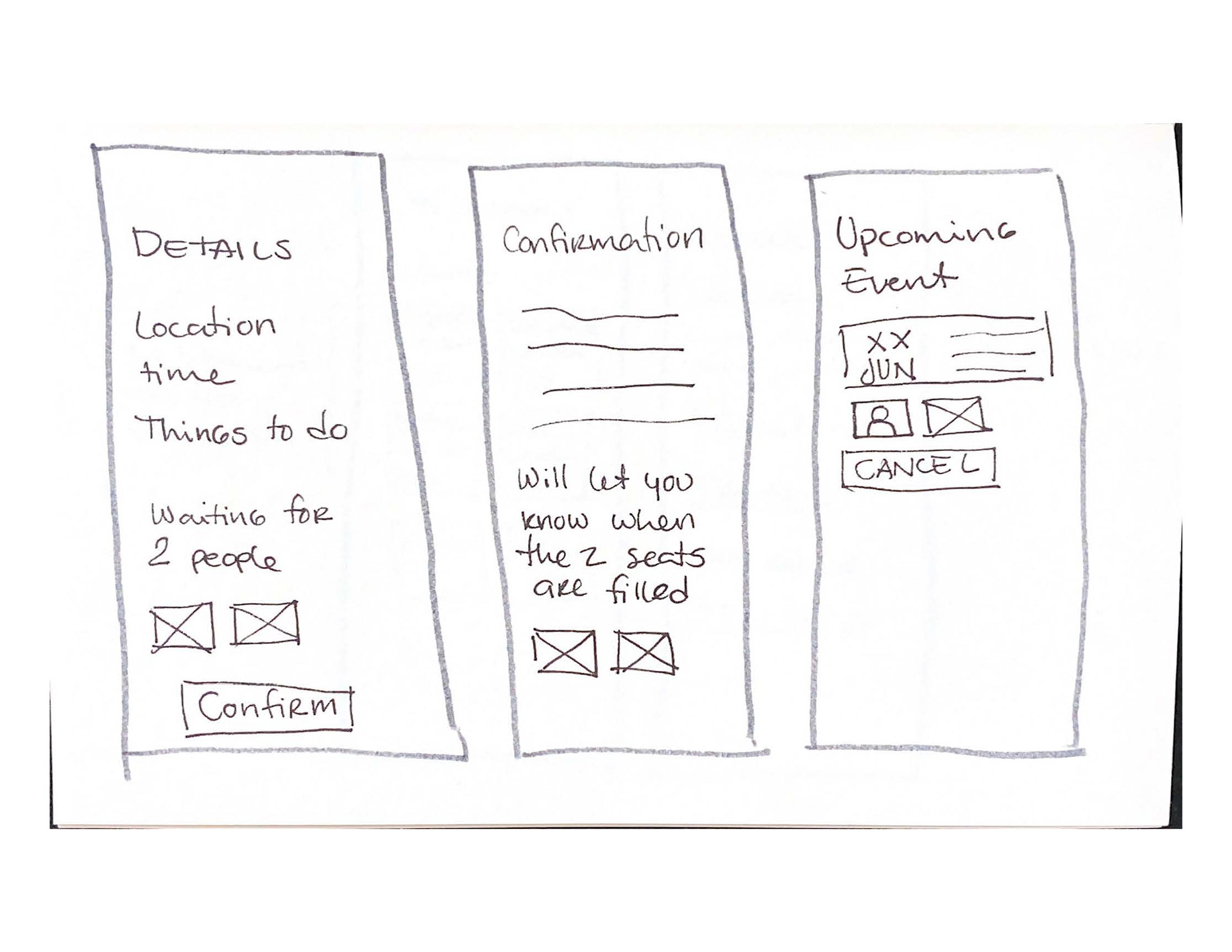
There were quite a lot of changes after the first round of user tests but changes were well received.
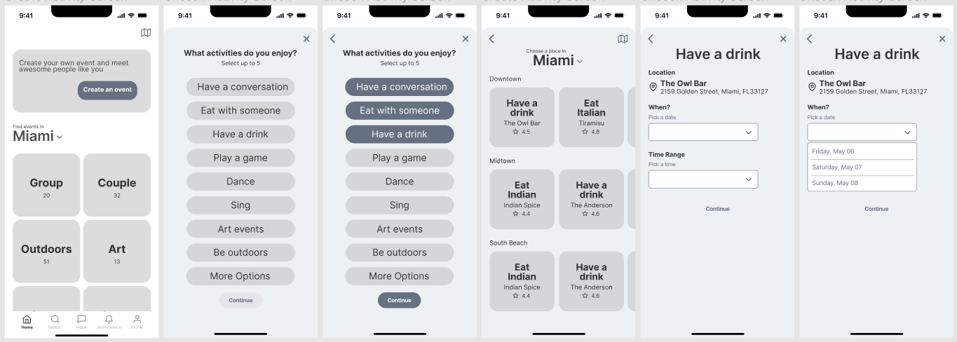
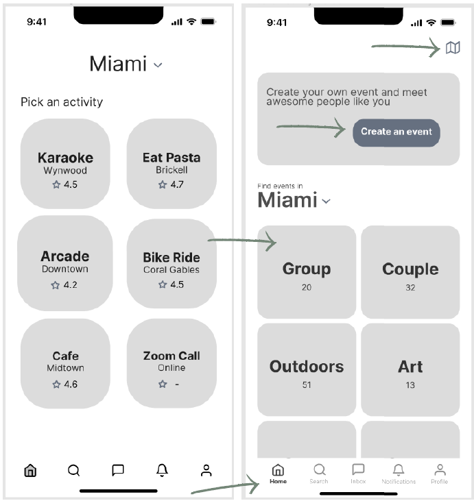
1. The home screen was changed to give more clarity to the user where is landing. Now it has an option to create an event.
2. Events are also grouped in categories on the home screen to be able to search for them easily.
3. A map icon was introduced to give freedom to the user a look for events near them.
4. I added names for each icon as well.
Version 1 Version 2
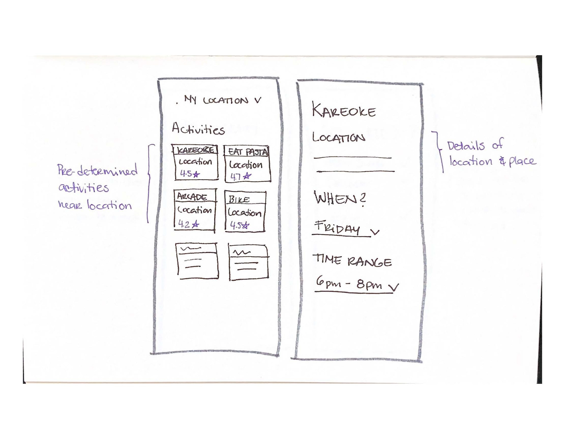
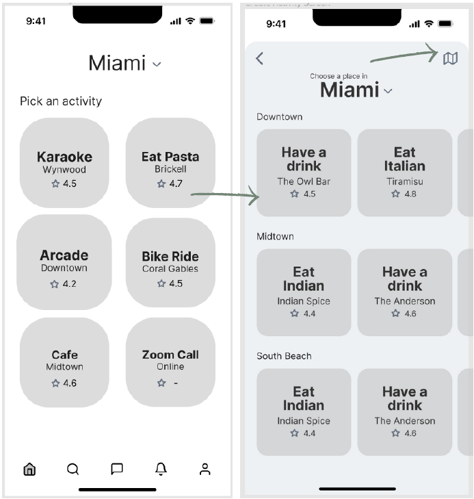
1. A new screen was introduced as well which is meant to respond to the activities selected on the previous screen.
2. I also added a map to give freedom to the users to be able to see places near them on a map.
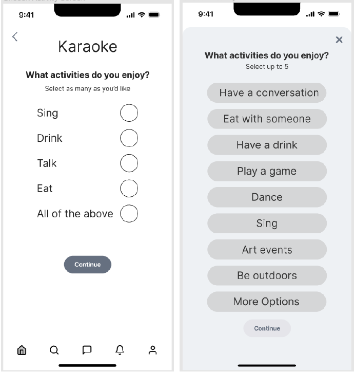
1. Now the second task and screen became the activities enjoyed to be able to filter what events the user might want to create.
2. I also made it take over the screen so that if the user wants to exit the process they can do so easily.
2nd Round
The prototype’s flow during testing was clear from beginning to end with a few points that need without major comments. There are some aesthetic adjustments to be made. It is important to give the users the flexibility to choose as many people as they would like. The map option should be in a clearer position.
greyscale version III
1. A greeting was added to the home screen, not only to fill the white space but also to add personalization.
2. The map icon was moved closer to the Miami tab in order to give more meaning to the search and make the map more obvious.
1. For the second round of user testing mostly aesthetics were pointed out except for one that did change the usability of the app.
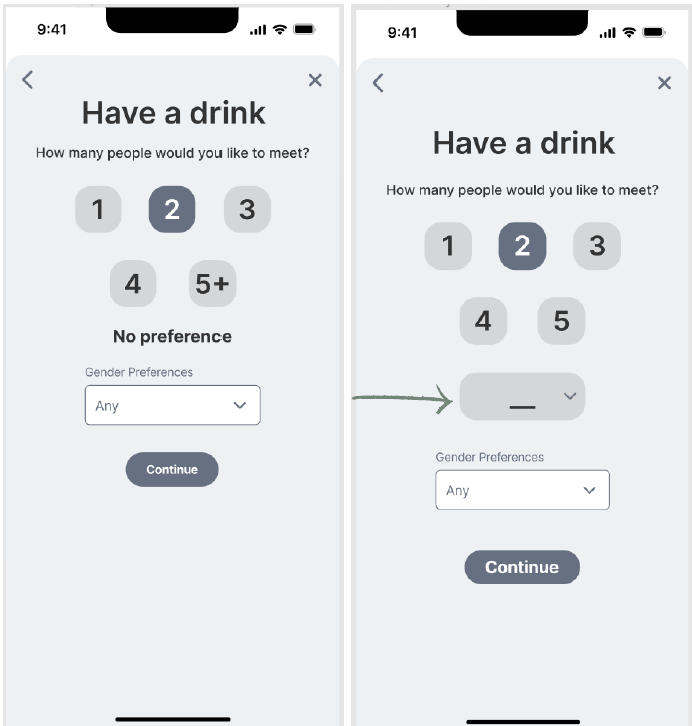
2. There was a need to be able to properly customize how many people the user wanted to be involved with for their event.
brand development
This phase started by first clearing the mind and letting it spill the first thing that came to mind which could serve later as a base or guidance.
I started to put words on "paper" to brainstorm to express the apps' voice
and it looked like this:
and it looked like this:
My brand is more this… than this…
Is more summer than winter
Is more happy than sad
Is more warm than cool
Is more inclusive than exclusive
Is more open-minded than closed
Is more flexible than firm
Is more clear than dark
Is more honest than deceiving
Is more creative than boring/traditional
Is more relaxed than uptight
You are worth it
You are everything
Where people have fun
Easy to find and connect with others alike
Find yourself
Find your people
Find your weirdos
Feel relaxed - at home anywhere
Dare to be yourself
Find people that energize you
Your weird matches my weird
Embrace your inner weirdo
“Make your weirdo light shine bright so the other weirdos know where to
find you”
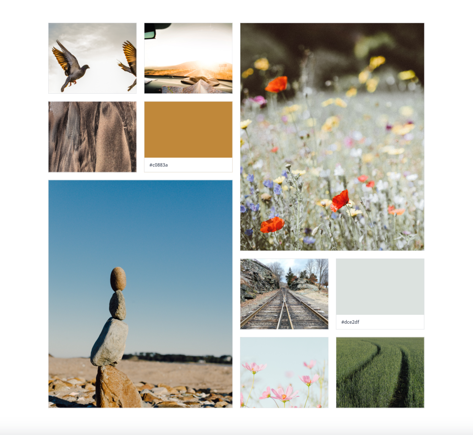
mood board
Connection, belonging, happiness
brand name & wordmark
During this process, I also brainstormed a possible name for the app:
“Let’s meet”
“Hey, you!”
*Bright” - this is the one that I liked the most
“Dazzle”
friend
“Let’s meet”
“Hey, you!”
*Bright” - this is the one that I liked the most
“Dazzle”
friend
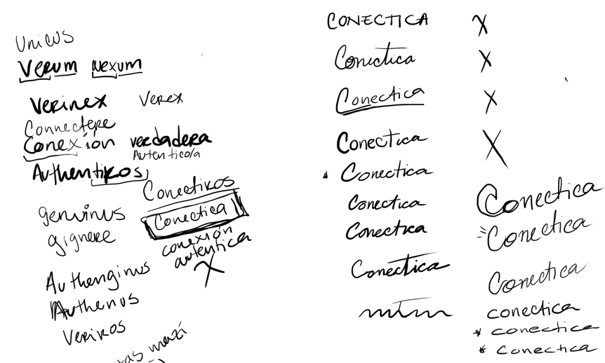
However, these names did not feel right... So I started to handwrite other ones.
I finally came up with 2: for-real and conectica
conectica = conexión + autentica
in English means authentic connection
After asking around, this one seemed to be the winner.
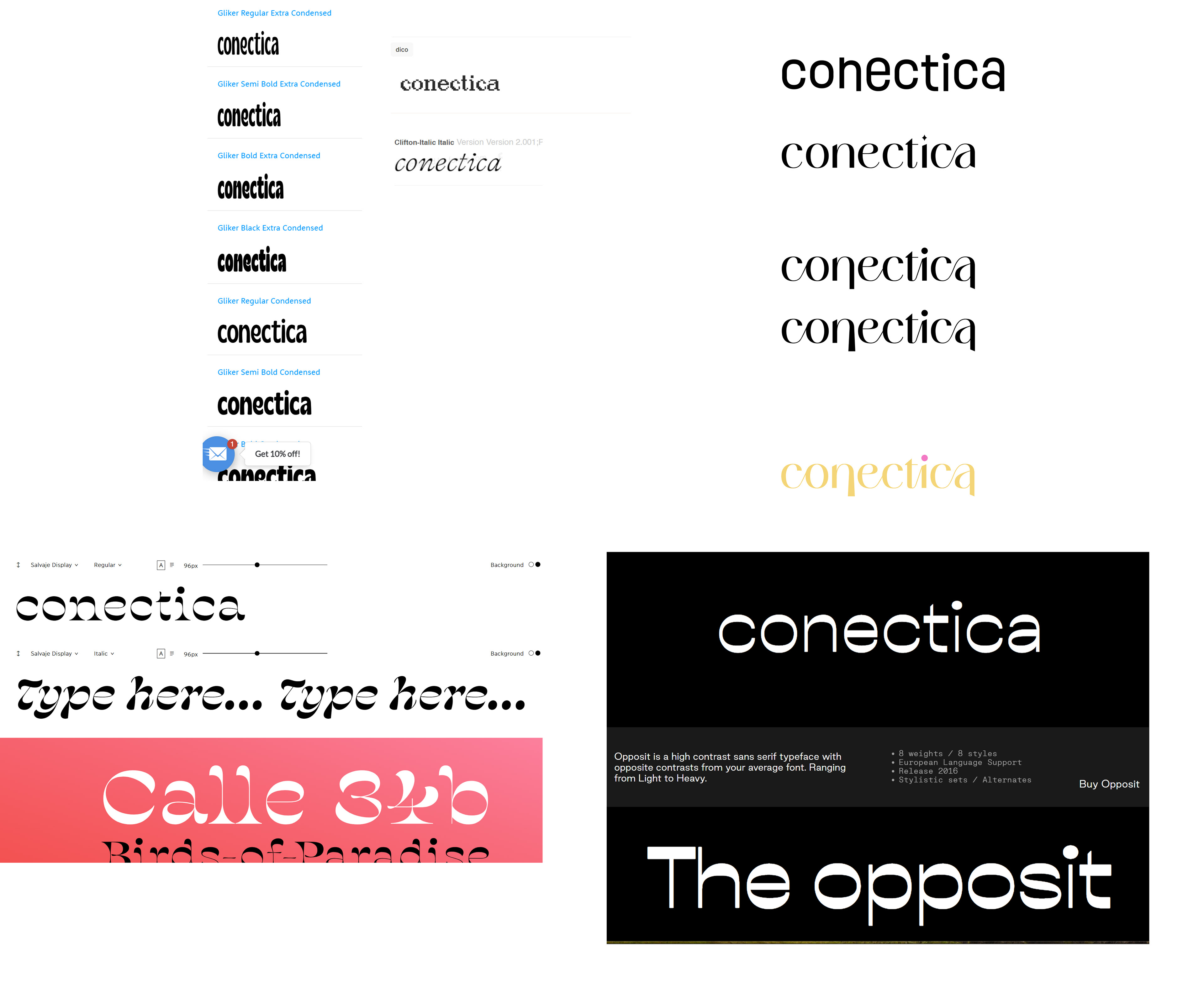
On the right, you'll see some explorations for the wordmark. I was even playing with the X because of the word conexión
final wordmark
Connected, irregular, different just like each individual is

color palette exploration
This was a difficult task because I could have taken many directions but color definitions helped me narrow it down to a yellow color which is also predominant on my mood board and pink from the flower to represent balance, passion, and imagination.
According to Leatrice Eiseman at Pantone, “yellow is thought of as joyful, outgoing, open, and friendly. Psychologically, yellow is the strongest color. It is associated with comedy, a happy mood, and playfulness. Yellow ribbons have been used as a sign of hope and optimism since the nineteenth century.
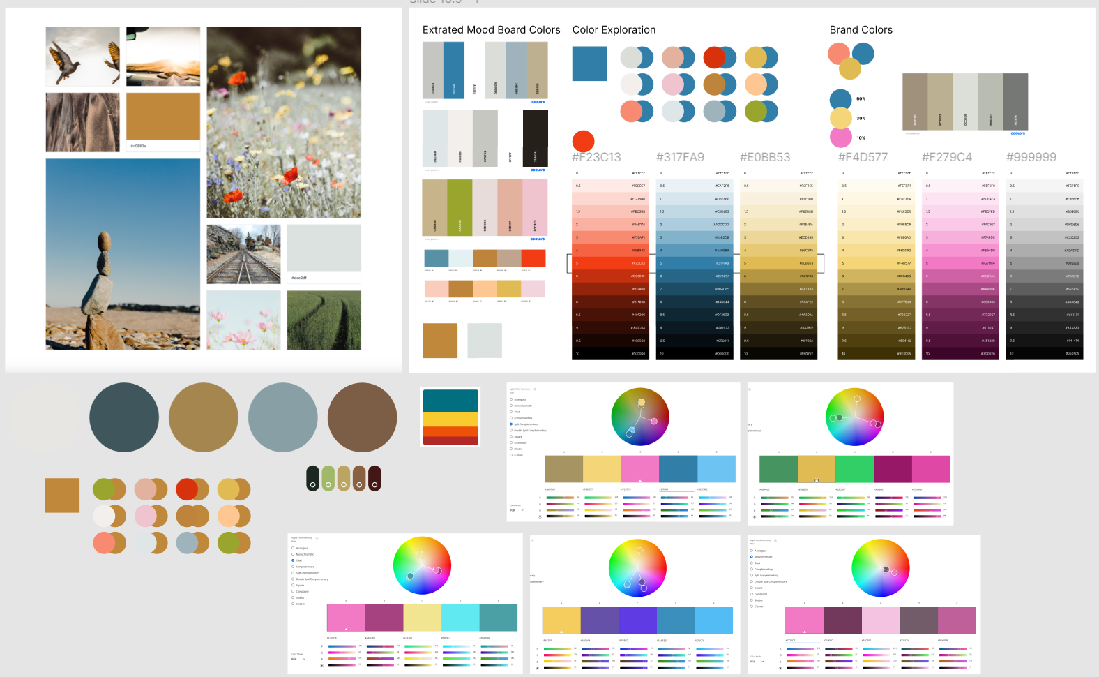
After the choice was taken, I started to play around with color injection.
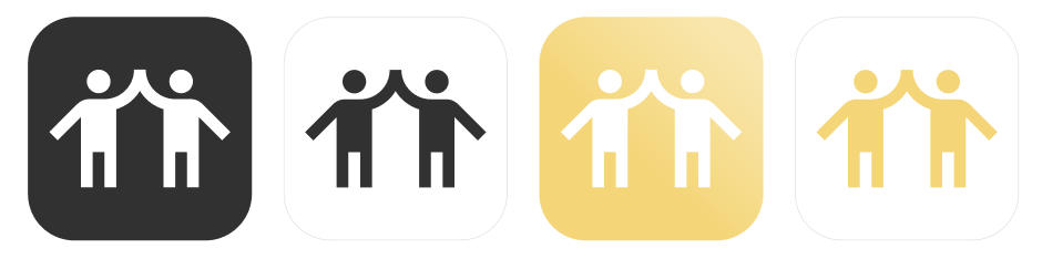
I thought the icon had to be something that would express friendship, so here is my
exploration. I combined and mirrored some of the icons to make it seem like they are celebrating.
exploration. I combined and mirrored some of the icons to make it seem like they are celebrating.
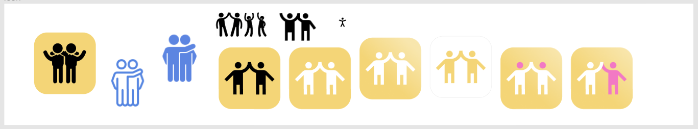
Once the icon was chosen I made color and B&W versions of it.
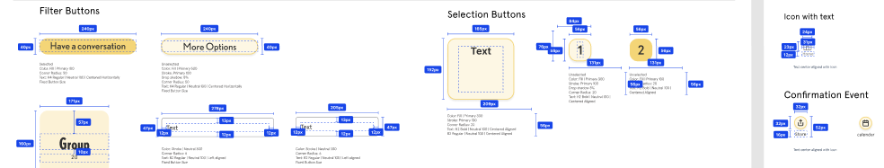
ui library
I compiled all elements in a UI library and organized them into atoms, molecules, and organisms. My app could be a living thing.
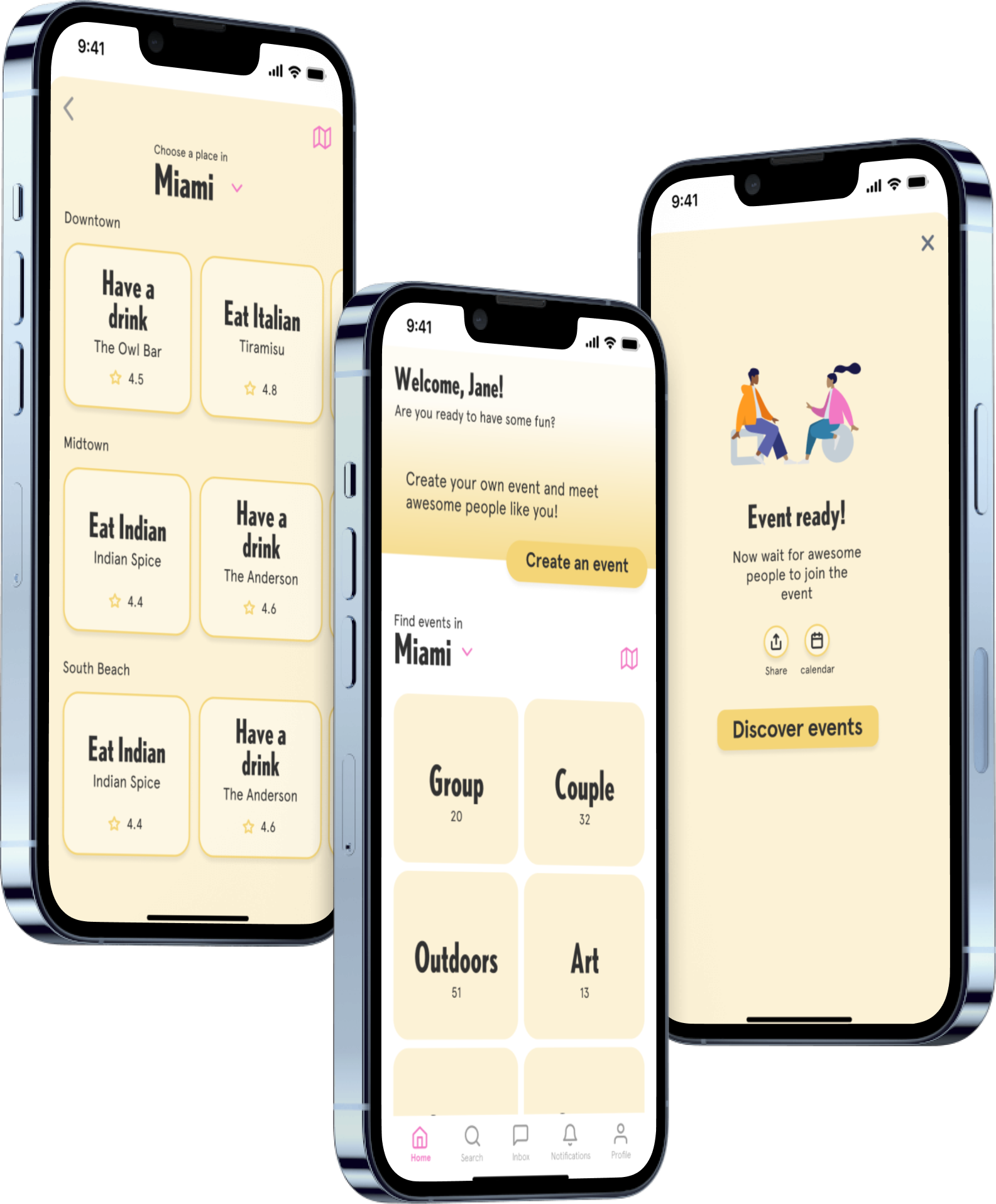
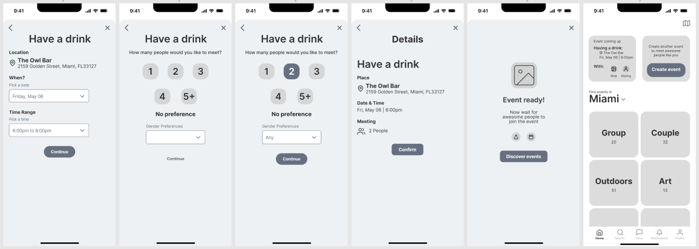
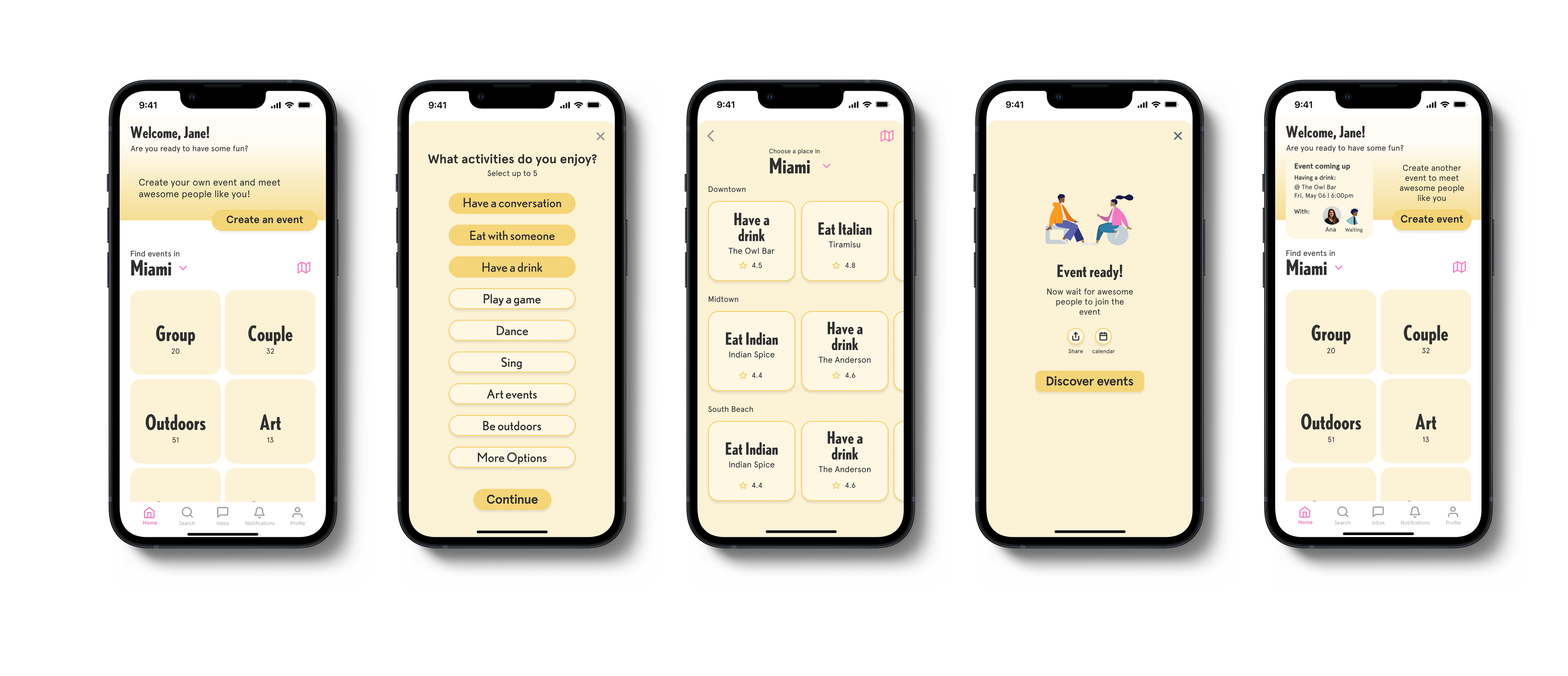
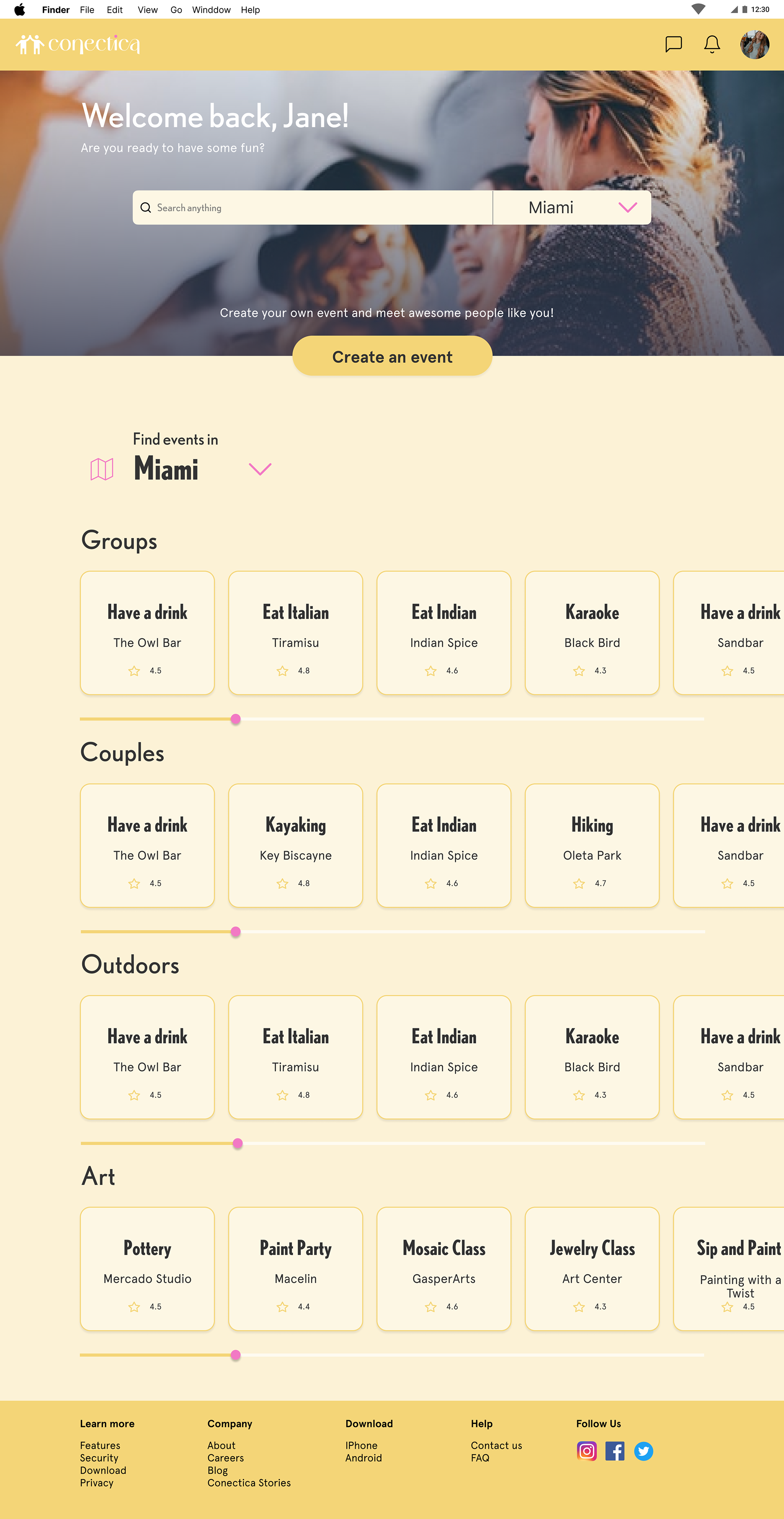
high fidelity prototype
I present to you, the final version. Feel free to play with it.
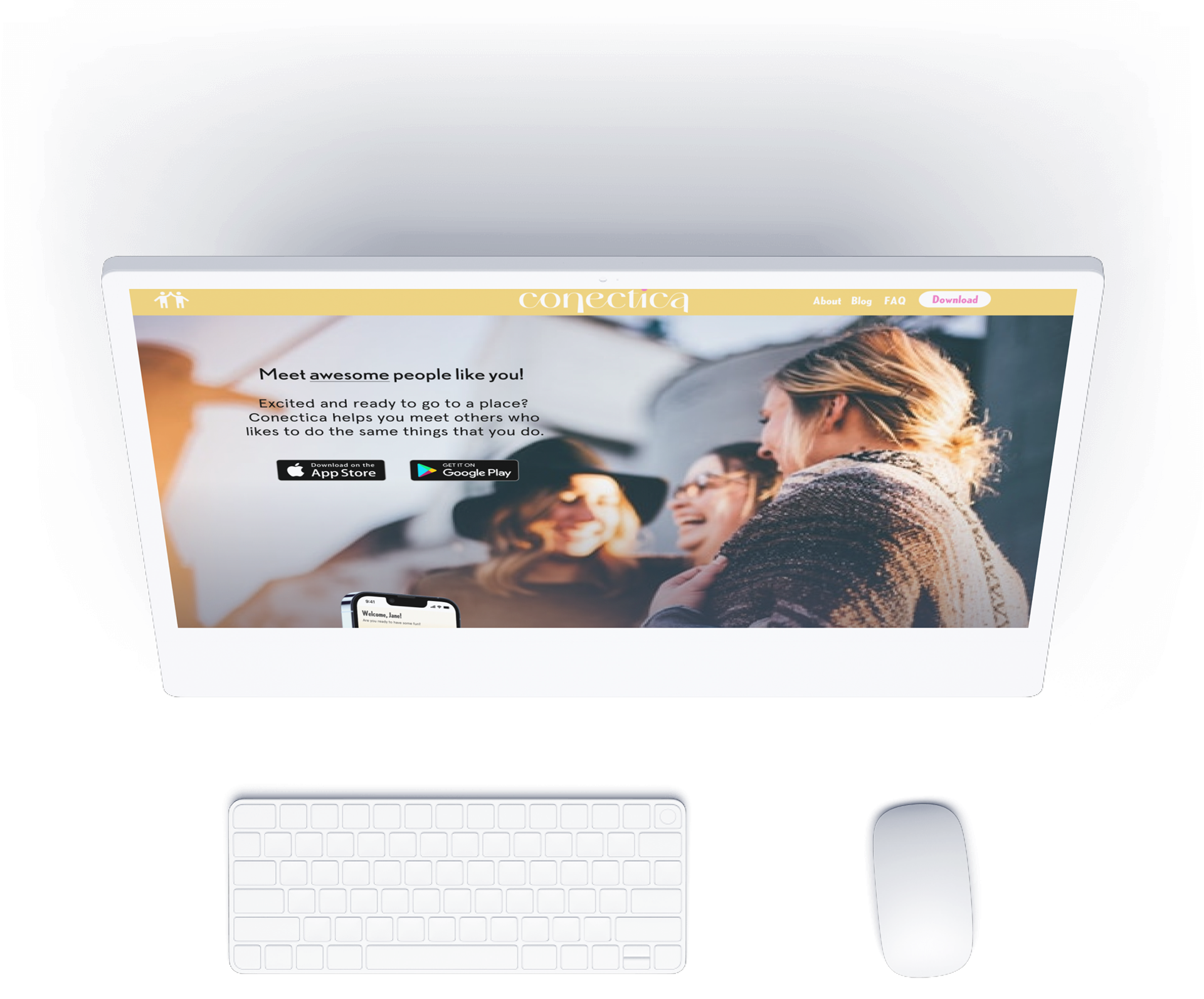
marketing website
I created a responsive marketing website for the app to invite potential users to try the experience. Researching, compiling a UI inspiration board, exploratory sketches, and wireframing for feedback.
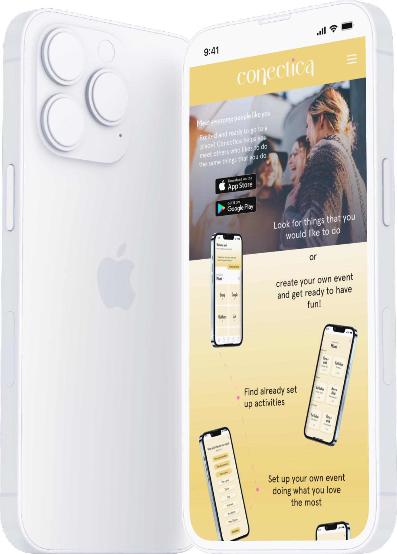
alternative platform
I explored creating a website version so that people who are already on their computer working or studying can just open and tab and use it without the need of downloading the app.
next steps
User Test
The app should be further tested to see how how the user reacts to it and see if the intended reaction is expressed.
Feature
There is a lot more that it can be done. For this app to work as intended there should be more integrated features.
Design
I would like to explore more design styles and look at possibilities to give the app more depth and animation.
key learnings
Endless possibilities
There are so many ways to tackle a problem. It is necessary to narrow down ideas and approach one problem at a time.
feedback
Having another set of eyes can bring a lot of value with ideas to improve the project.
trust
Trust the process. One thing leads to the other and most times it is necessary to iterate and that's ok. It will work out in the end!
Final thoughts
These past 10 weeks were intense but wonderful. This project opened my eyes, even more, to see through the eyes of others. There’s no doubt I should go back and dive deeper into each section since it was done so fast. I learned to stop thinking about what I believe but to observe and listen to other people’s needs. This is not always easy because there might be a need that doesn’t exist or that people don’t know they need or just don’t know how to articulate. It might be challenging but through research and creativity, there are many possibilities to meet those needs. I am proud of how far I have come in so little time but I am excited to keep putting into practice all that I have learned because there is a lot more to be improved.